UI/UX design service
 Website Development
 Branding
About the Client
Day2Day
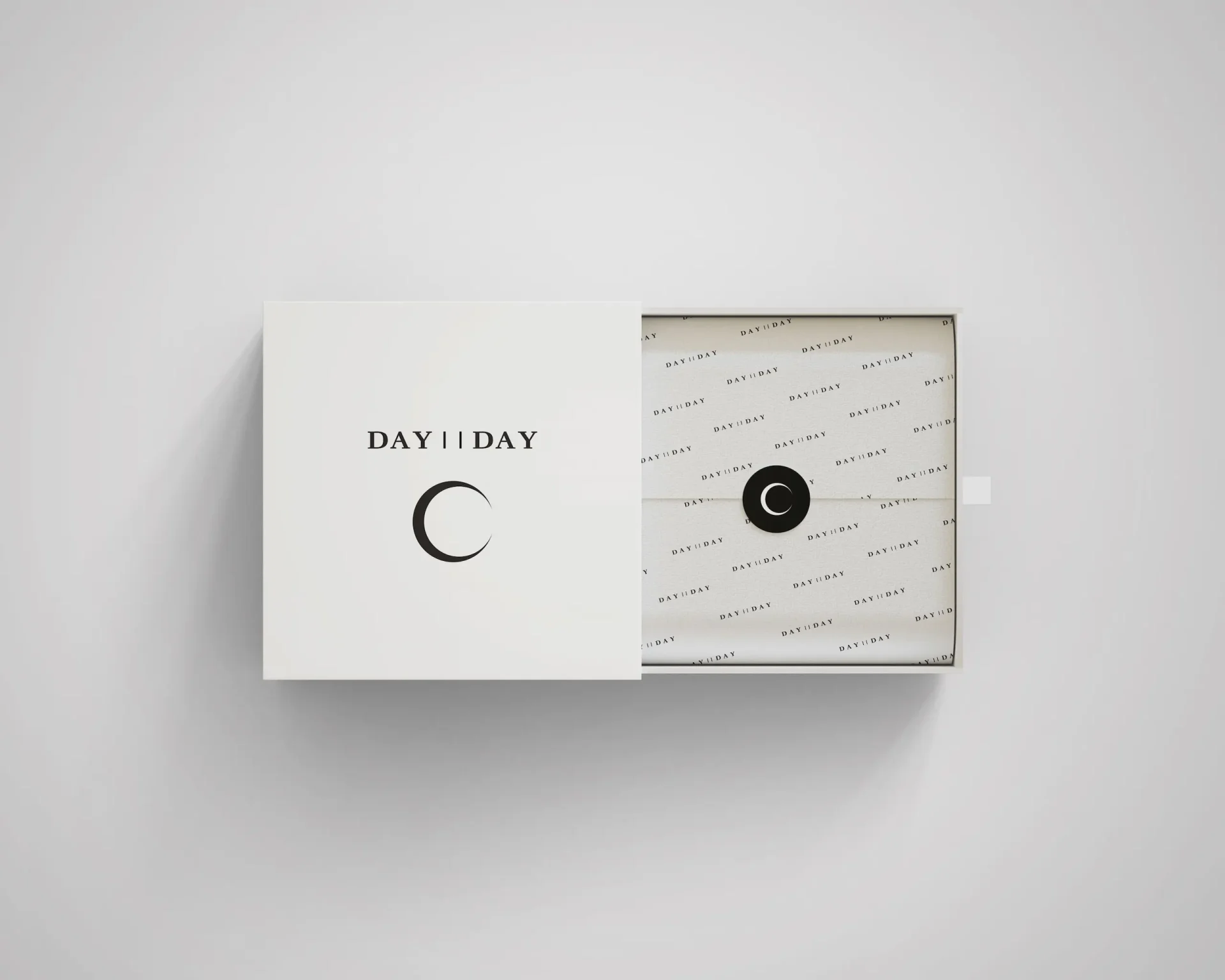
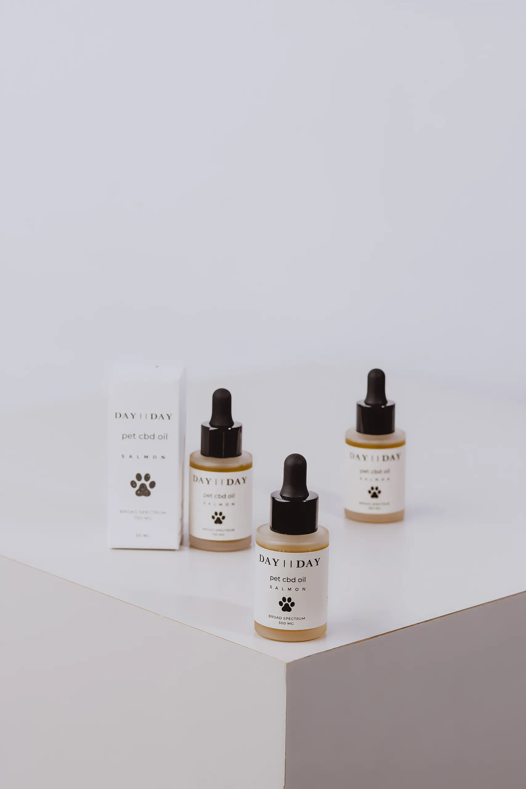
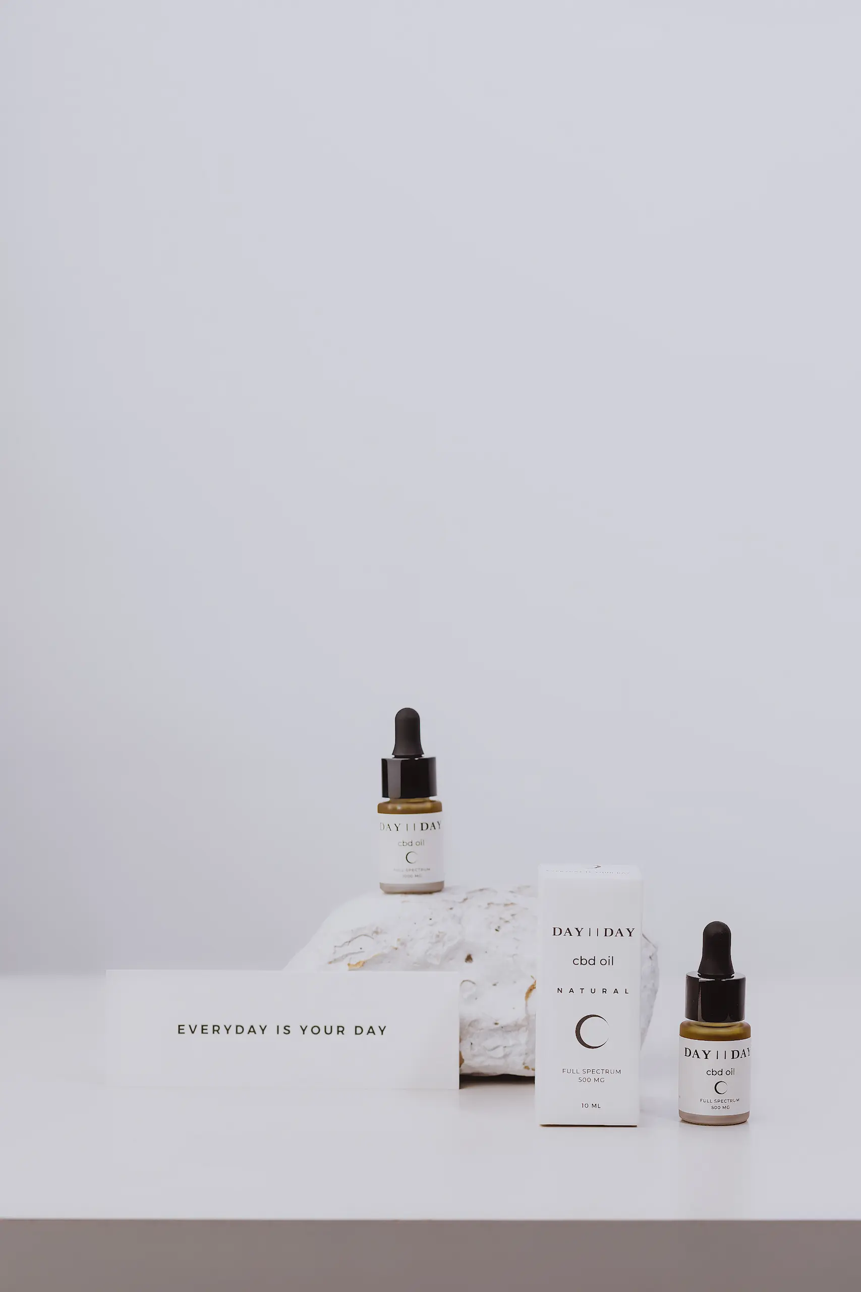
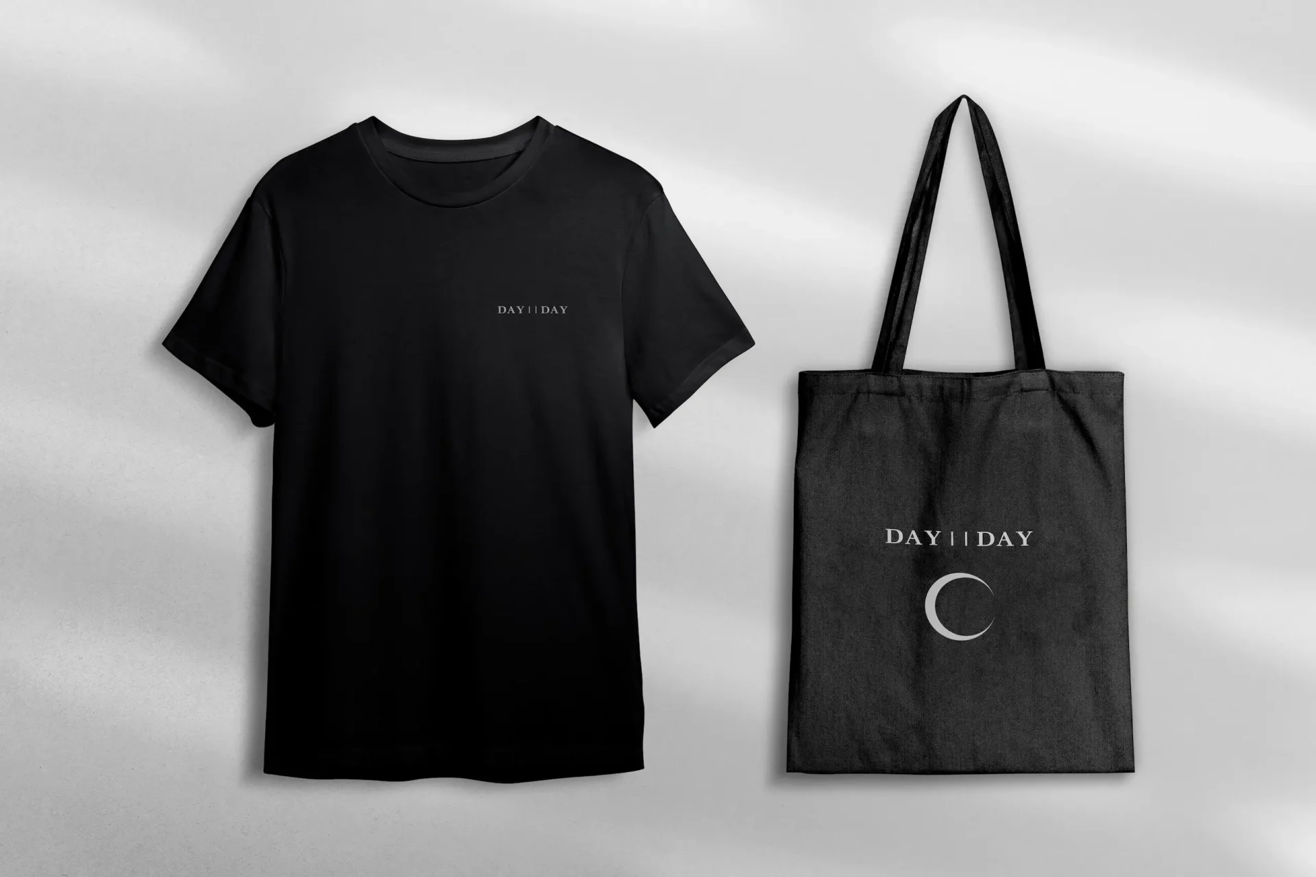
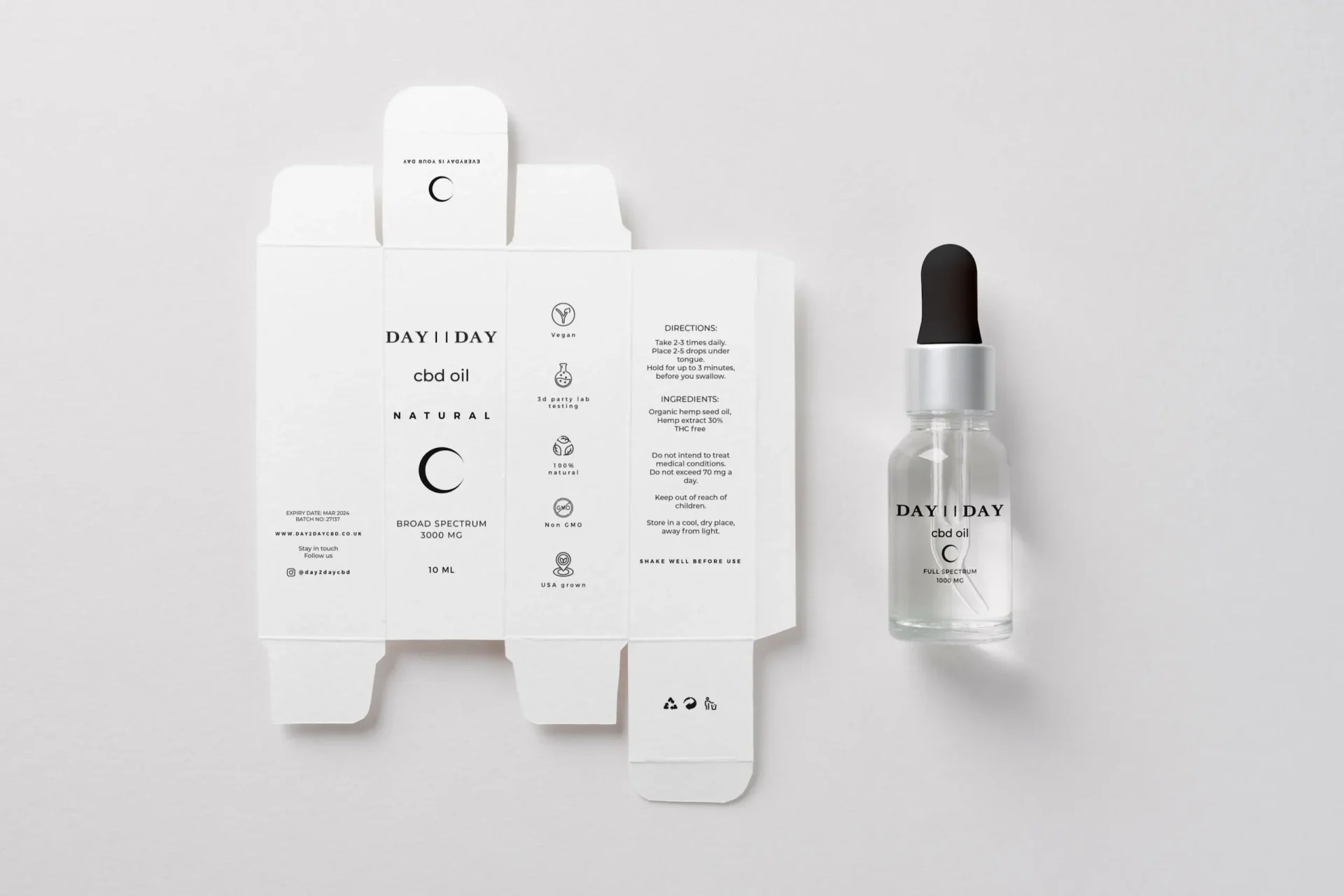
Branding
Logo, branding, packaging design.
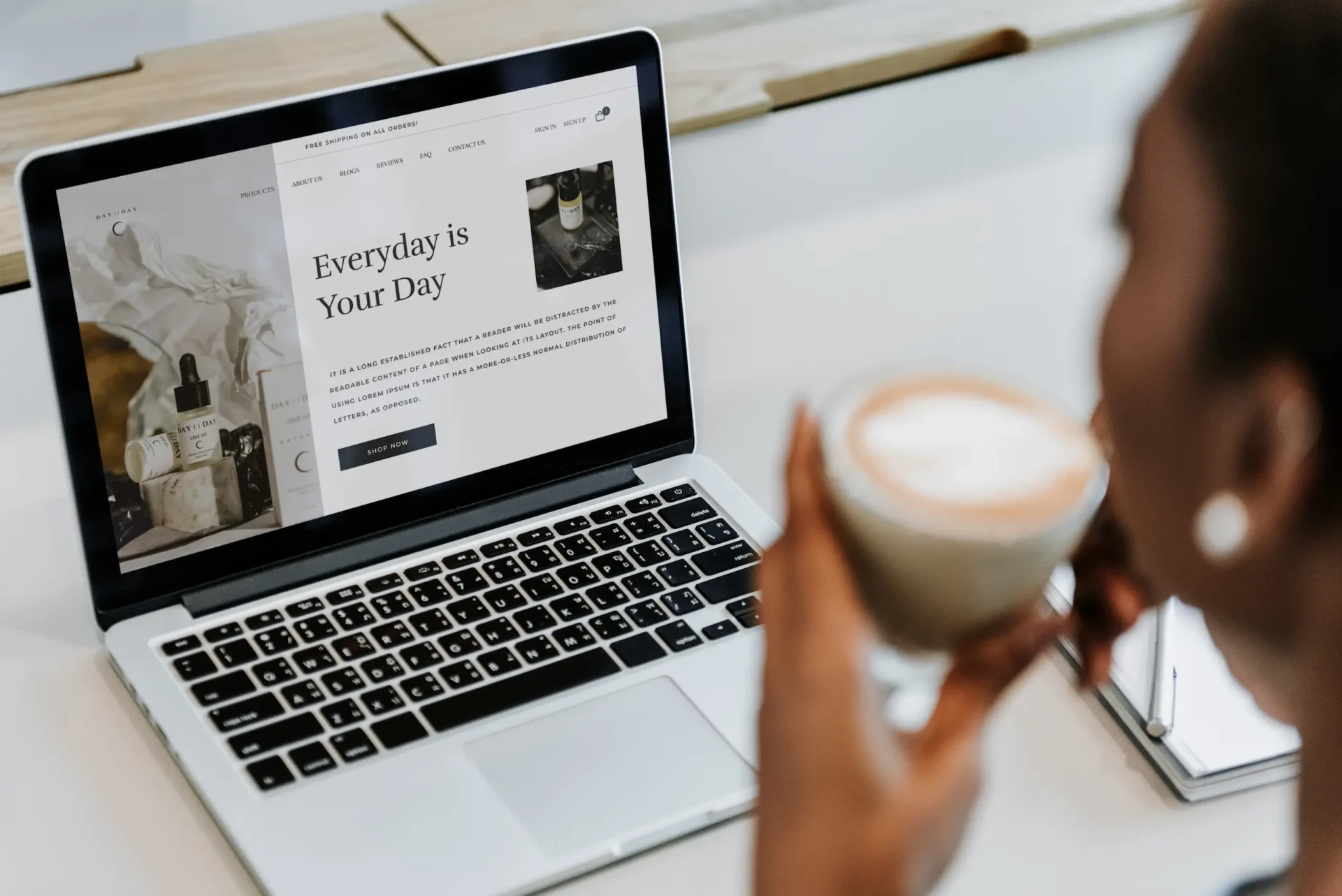
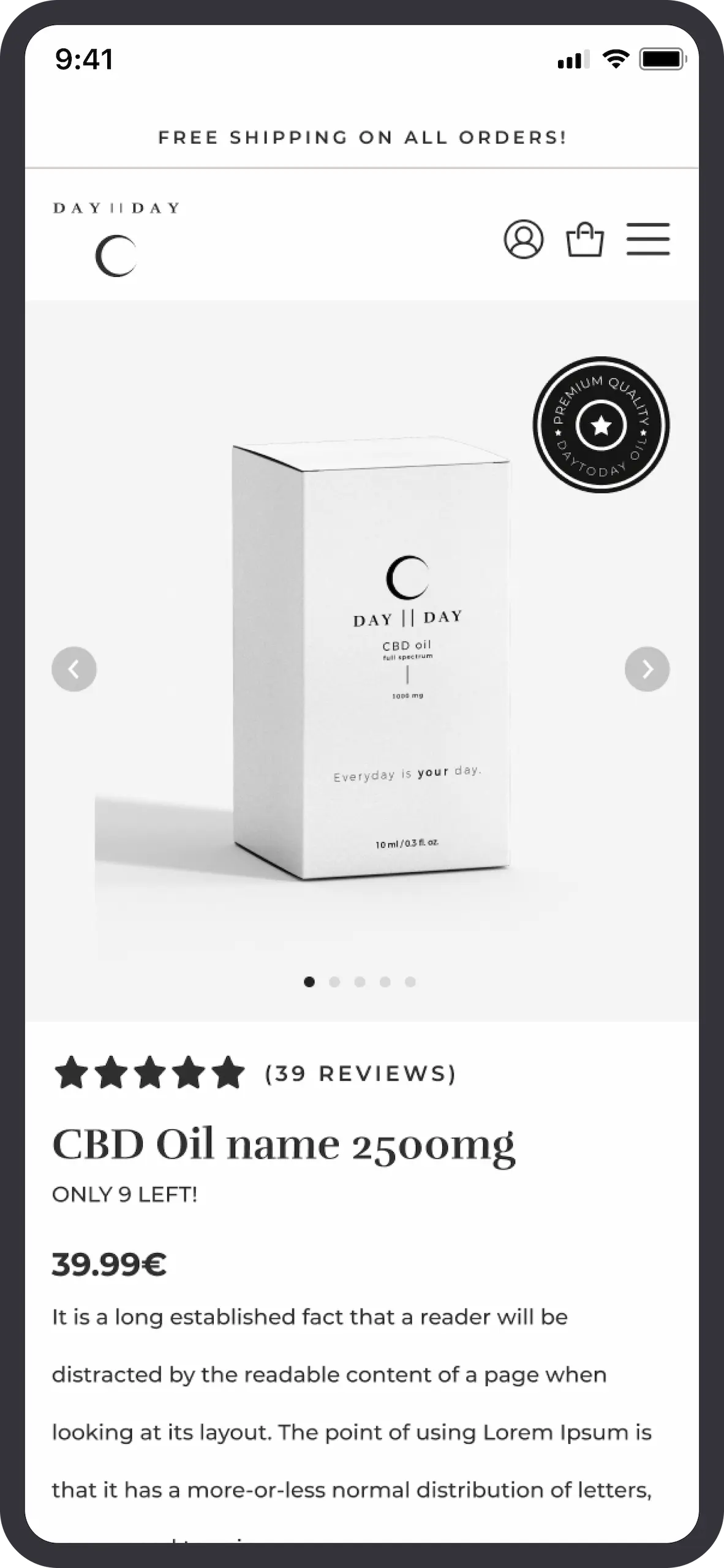
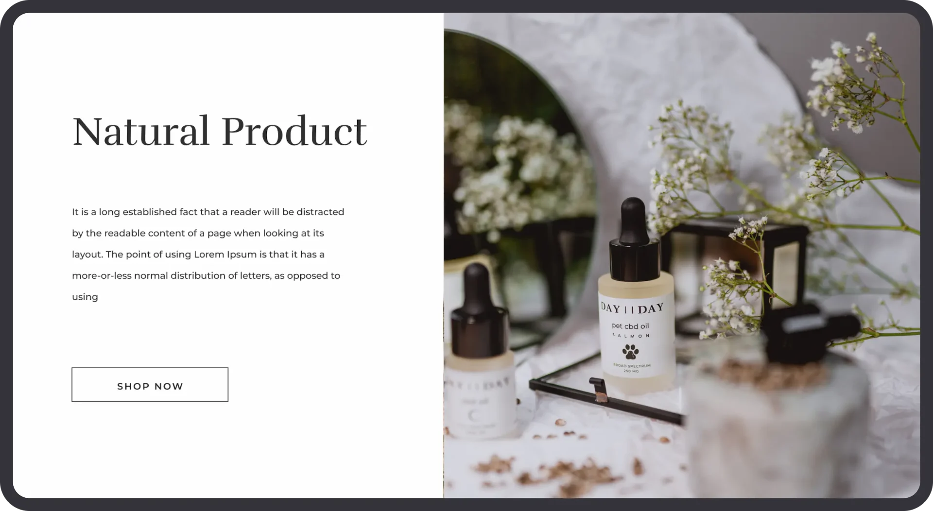
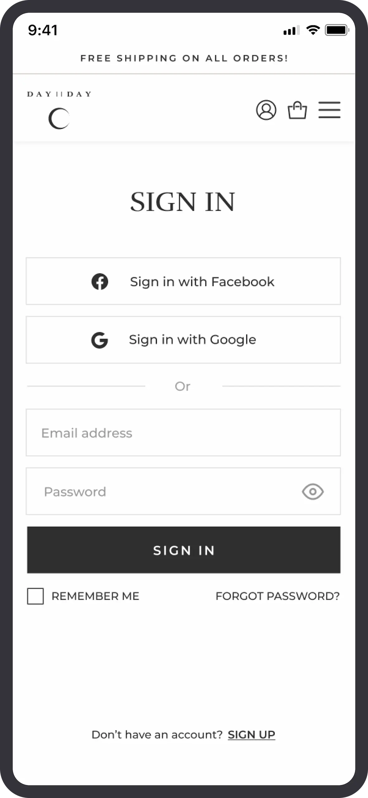
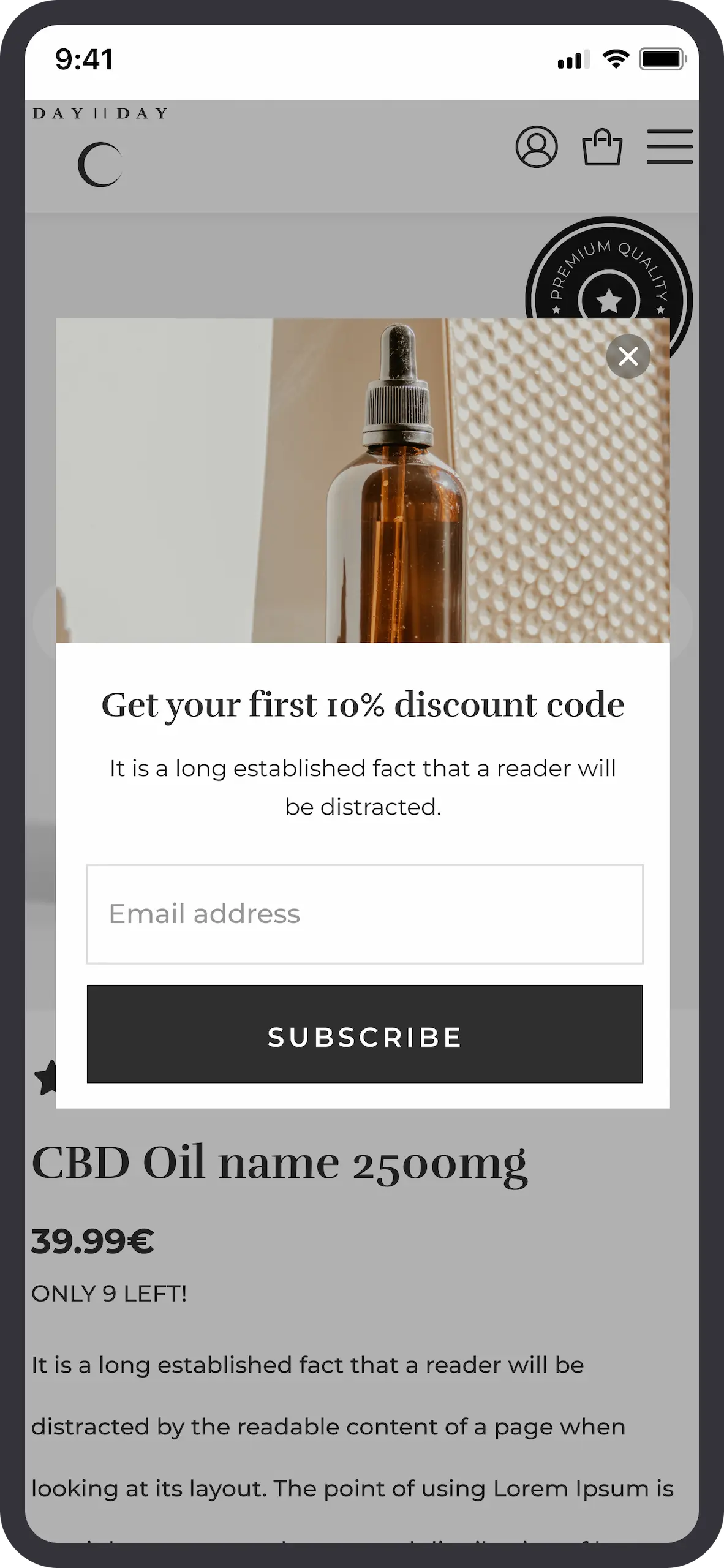
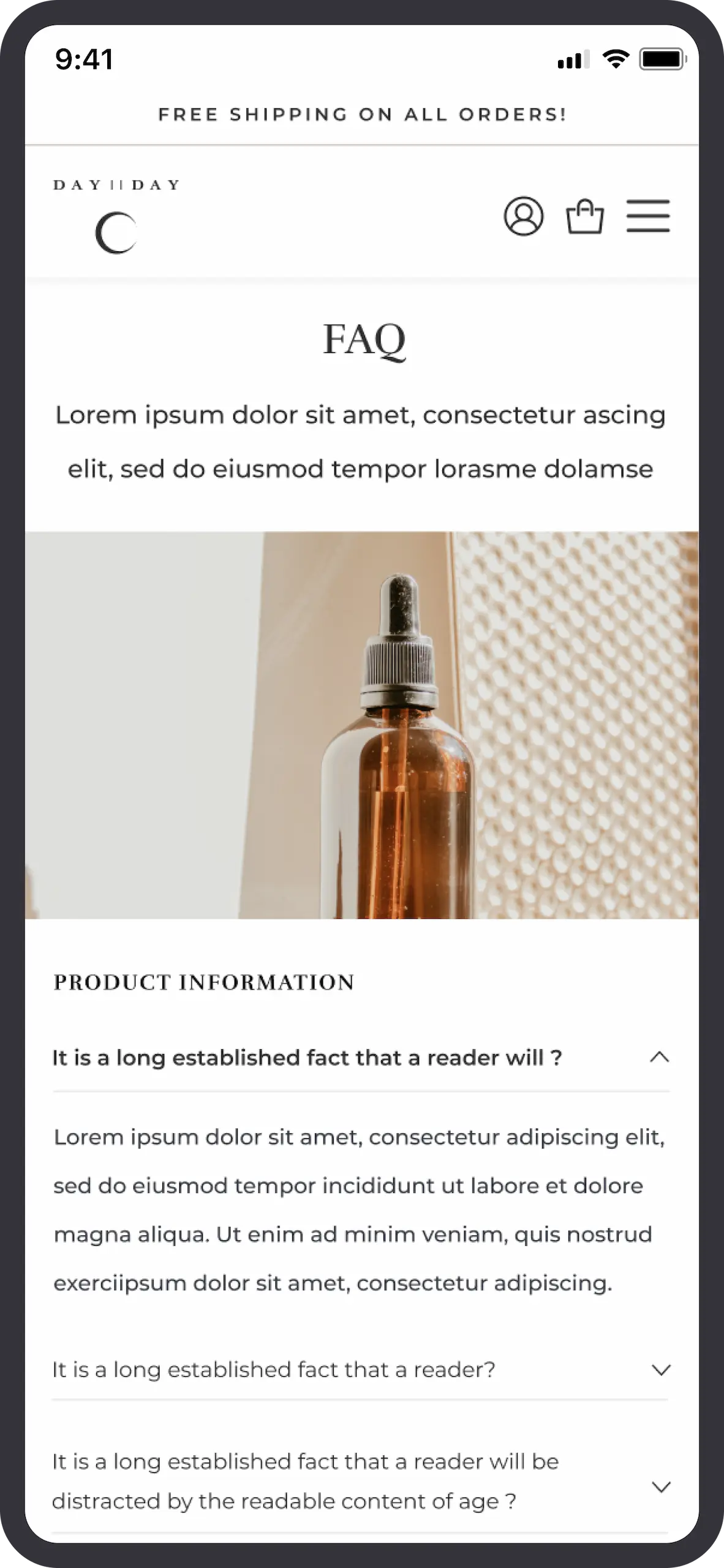
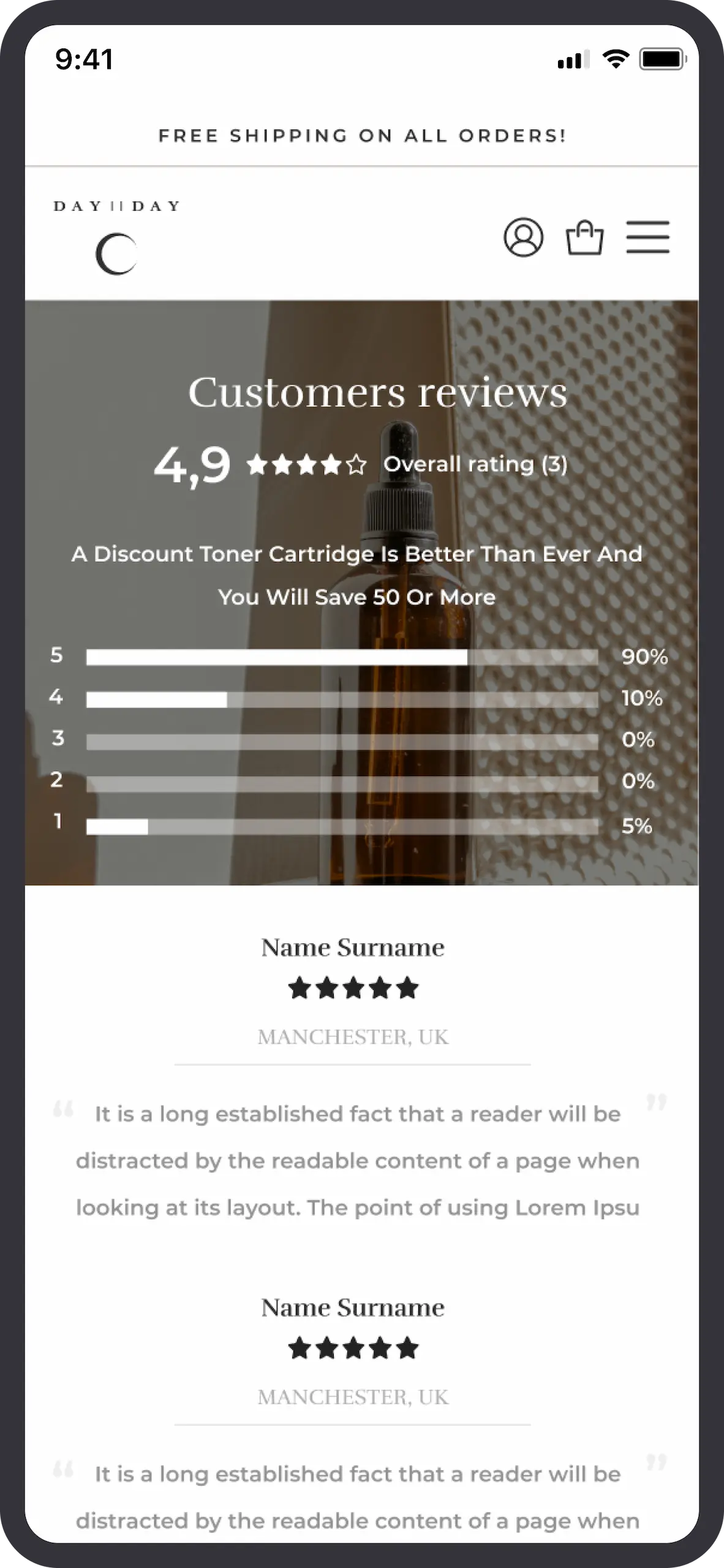
UI/UX design
Wireframes, UX and UI design.
Development
Custom WordPress website development.
Project Goal
Our main aim was to craft a design that would turn heads in the market, presenting Day2Day as a top-quality player right from the start.
Working on a project from the start, and delivering every branding and web design aspect helped us keep a strong and consistent design language.
Despite being a newcomer to the market, the crafted design ensures sets a foundation of credibility right from the start.

While aesthetics were crucial, we prioritized ensuring a seamless user experience and conversions oriented design.
Now Day2Day has fantastic fundamentals to conquer their market and have extreme confidence in their design going forward.